
Pharmacy website design patients can actually use.
Light, fast and service-led. We design for how patients really use a pharmacy site: on a phone, in a hurry, looking for one service or one form.
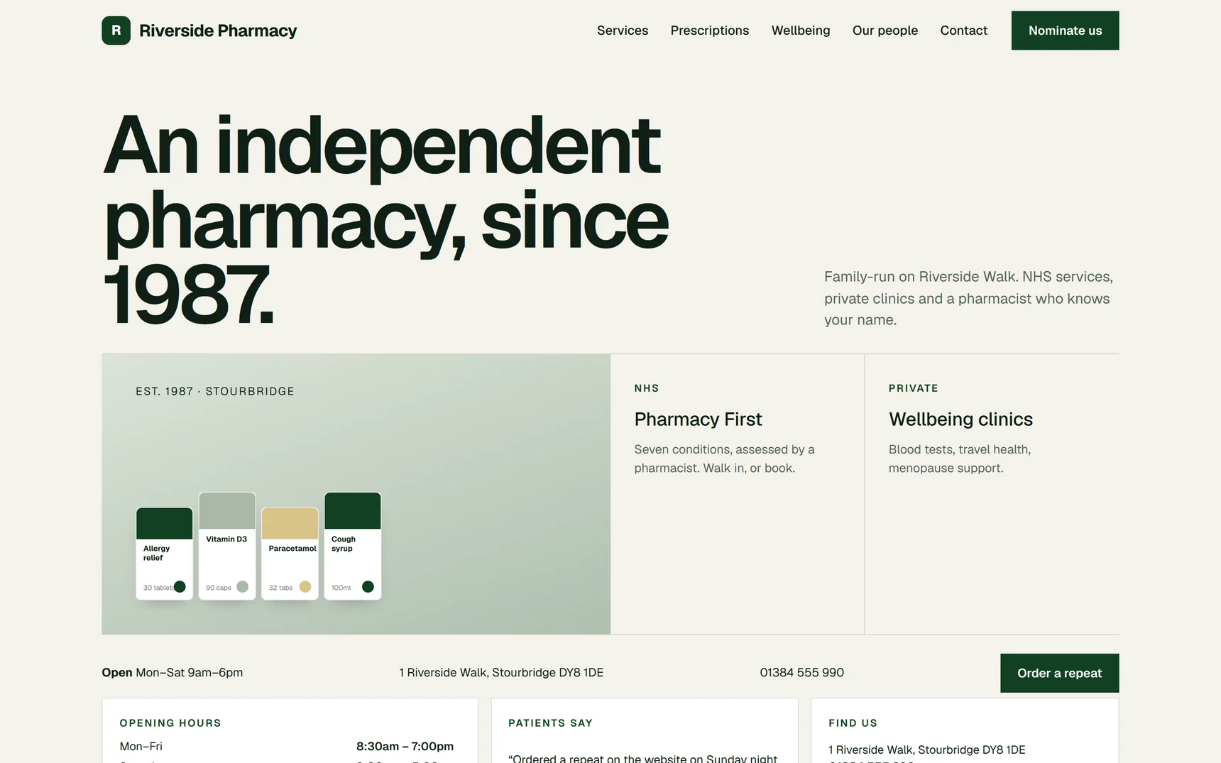
Eight art directions on one platform.
The same PharmGrowth code, eight different pharmacies. Palette, type, navigation, service priority and layout change; the forms, dashboard and compliance blocks do not.
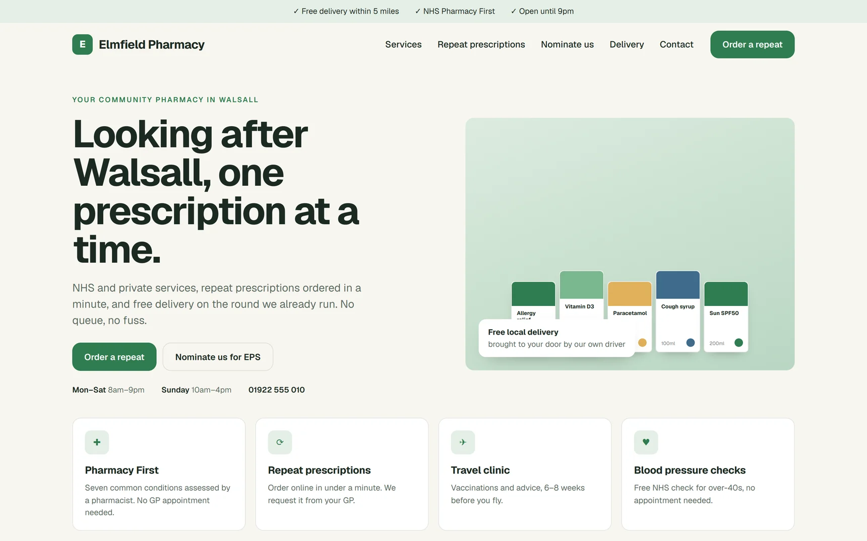
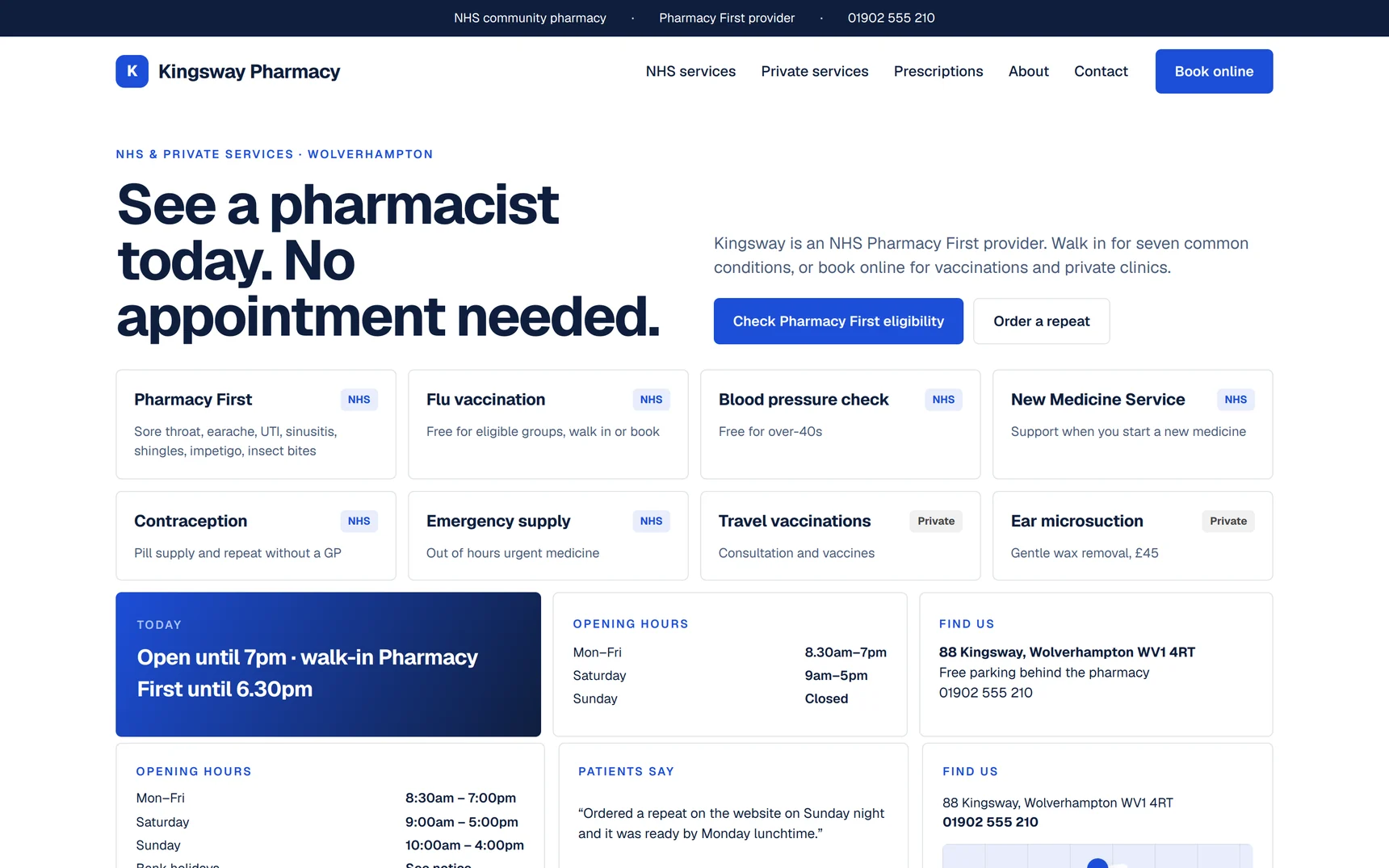
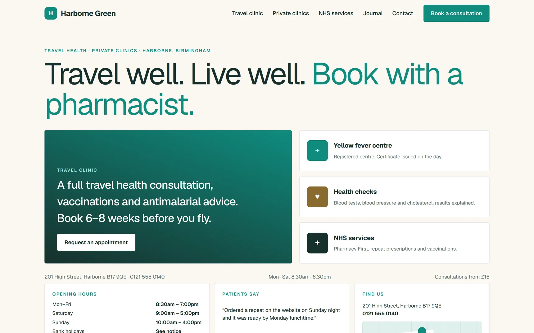
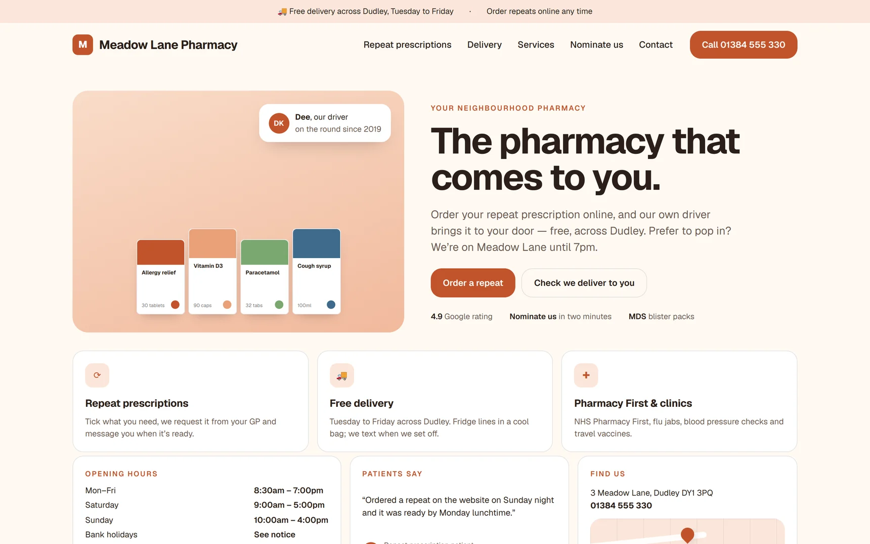
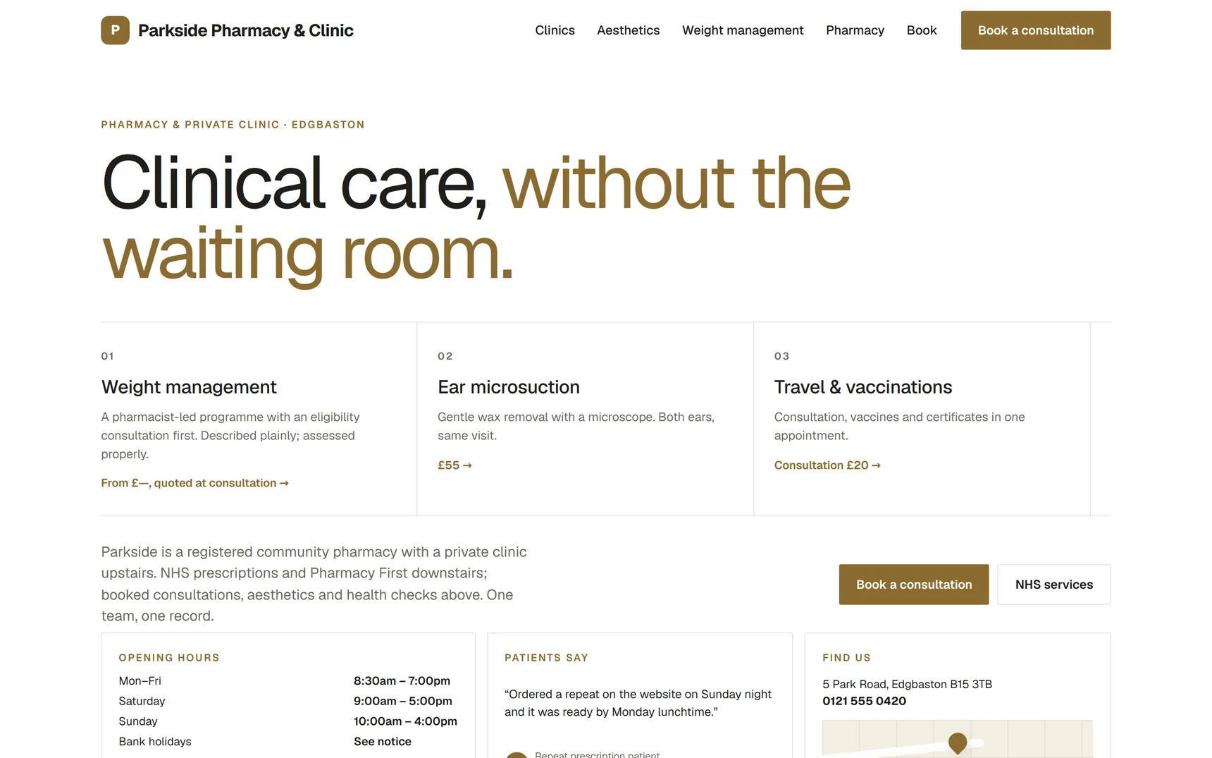
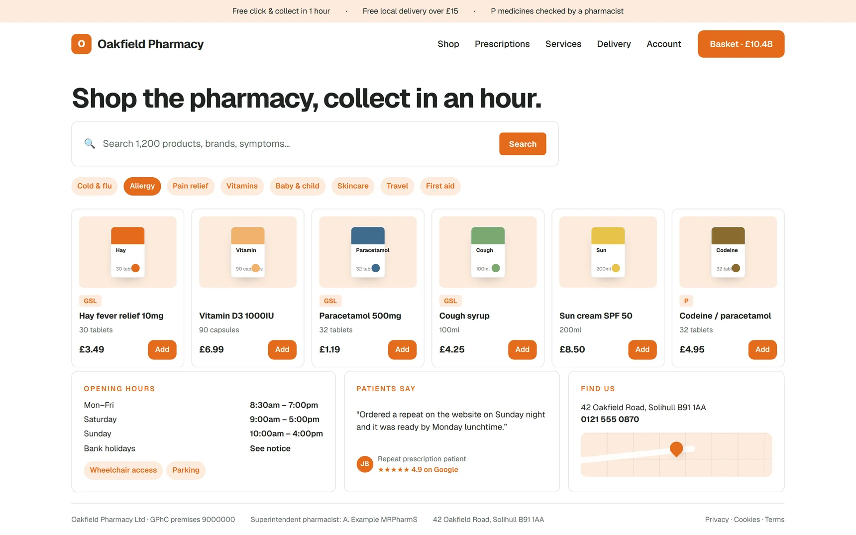
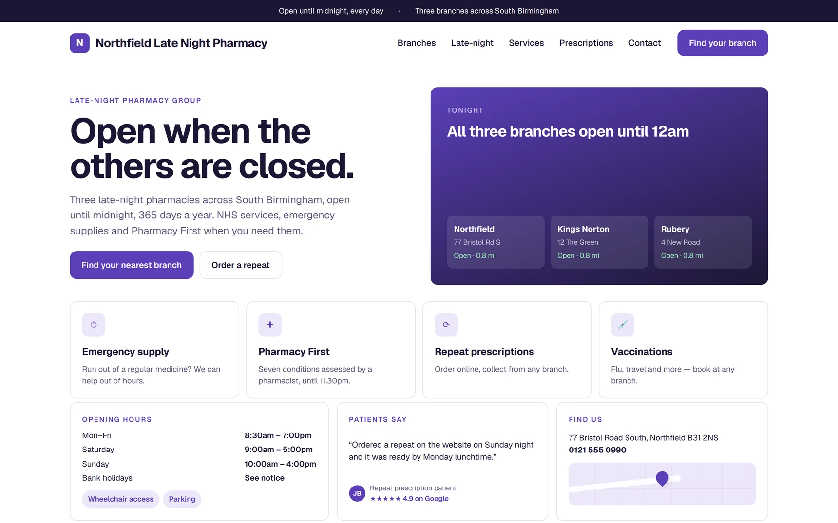
Demo designs are fictional pharmacies built on the PharmGrowth platform. They are not client work — live client sites are on the our work page.
What good pharmacy design looks like
Light, not loud
White backgrounds, one accent colour, dark legible text. Dark colour-heavy themes look striking in a portfolio and tire an older patient in ten seconds.
Website examplesService-led structure
Every NHS and private service on its own page, named the way people search, with eligibility and a booking form.
The complete page listAccessible by default
Contrast, text size, form labels and keyboard operation, because pharmacy patients skew older.
Accessible pharmacy websitesSee the design on your own pharmacy first.
We build the demo with your name, logo and services before you pay anything. Change what you want changed; go live when you are happy.
Design: questions owners ask
01Can I choose the design?
Yes, within the principles that make pharmacy sites work: light backgrounds, one accent colour from your branding, real photographs and a page per service. We show you the design on the demo and change what you want changed.
02Do you use my logo and colours?
Yes. Send a logo in any format and your colours if you have them; if you have neither we create a simple, clean identity with you.
03Do you use stock photos?
Only where you have no photographs of your own, and never stock images of pharmacists who do not work at your pharmacy.
04Is it accessible?
Contrast, text size, form labels and keyboard navigation are built to WCAG 2.2 AA principles as standard.