
The quickest way to understand what a good pharmacy website looks like is to look at some and ask what each one gets right. Below are the pharmacy sites we build and still look after, with the specific decisions worth copying — followed by the patterns that separate good pharmacy websites from the "digital leaflet" most pharmacies still have. Every screenshot is a live site, not a mock-up.
Lyng Pharmacy, West Bromwich
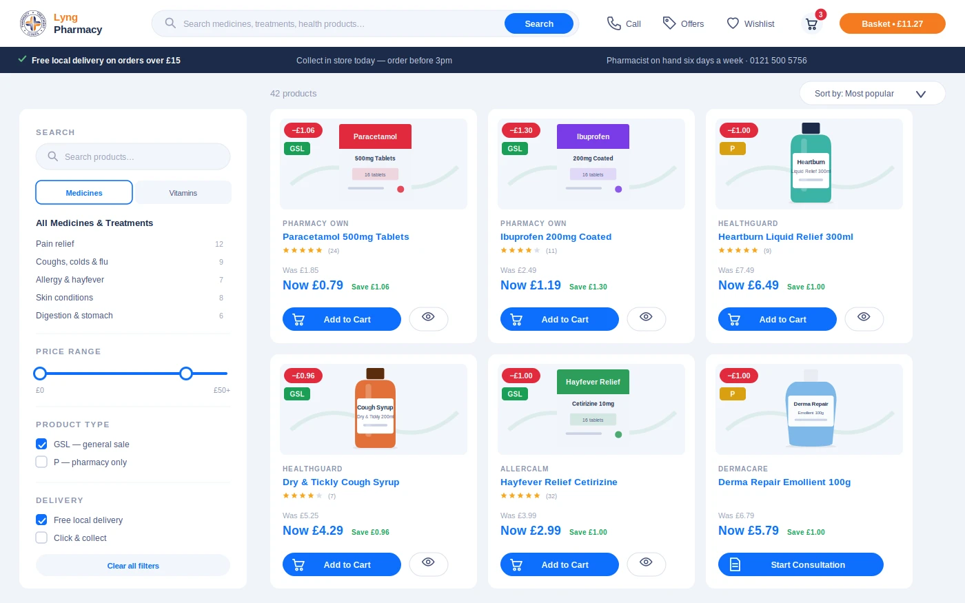
A busy community pharmacy with a delivery round and a dispensing robot. The site runs on PharmGrowth Plus, so it carries the full online shop: a product catalogue with quantity discounts, customer accounts, Stripe payments and click-and-collect or delivery at checkout. Two things worth copying: the shop is deliberately local (free delivery within a radius, collection any time) rather than pretending to be a national retailer; and P-medicine orders are held for a pharmacist to approve before payment is captured, which is how the supply rules are met without slowing down GSL orders.
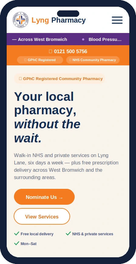
On a phone, the repeat prescription and nomination actions are the first things you see. Most repeat requests arrive from a phone, so the mobile layout is the design, not an afterthought.
Khaira Pharmacy, West Bromwich
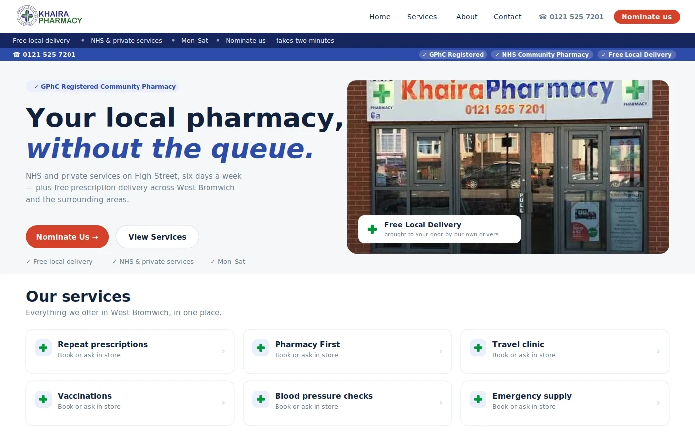
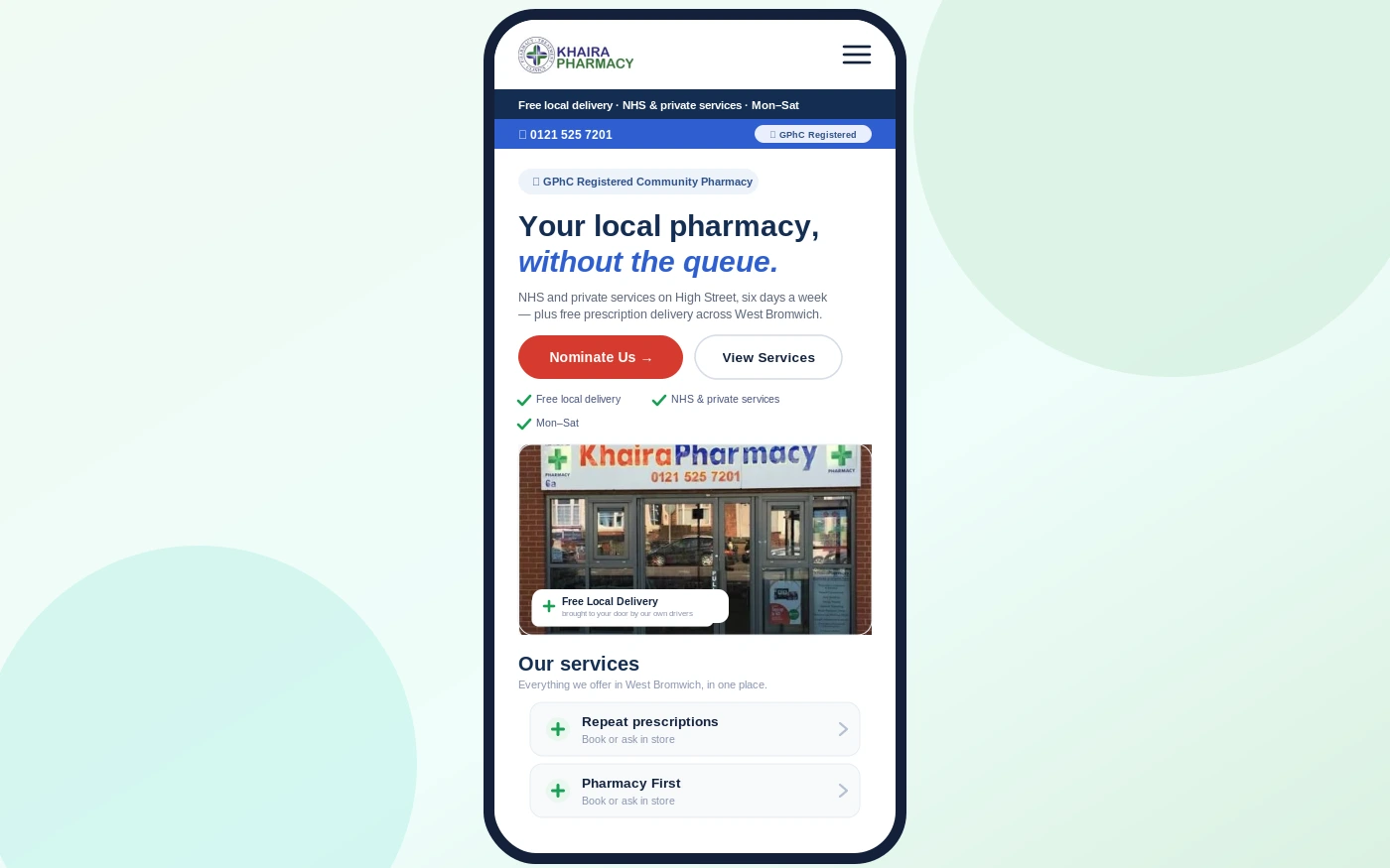
A high-street pharmacy running NHS and private services side by side, on PharmGrowth Starter: service pages, nomination and repeat forms, no shop. What it gets right is the service directory — every NHS and private service has its own page with eligibility questions before the booking, so patients arrive knowing whether they qualify, and the pharmacy's Google Business Profile lists the same services one for one.
Oldbury Late Night Pharmacy
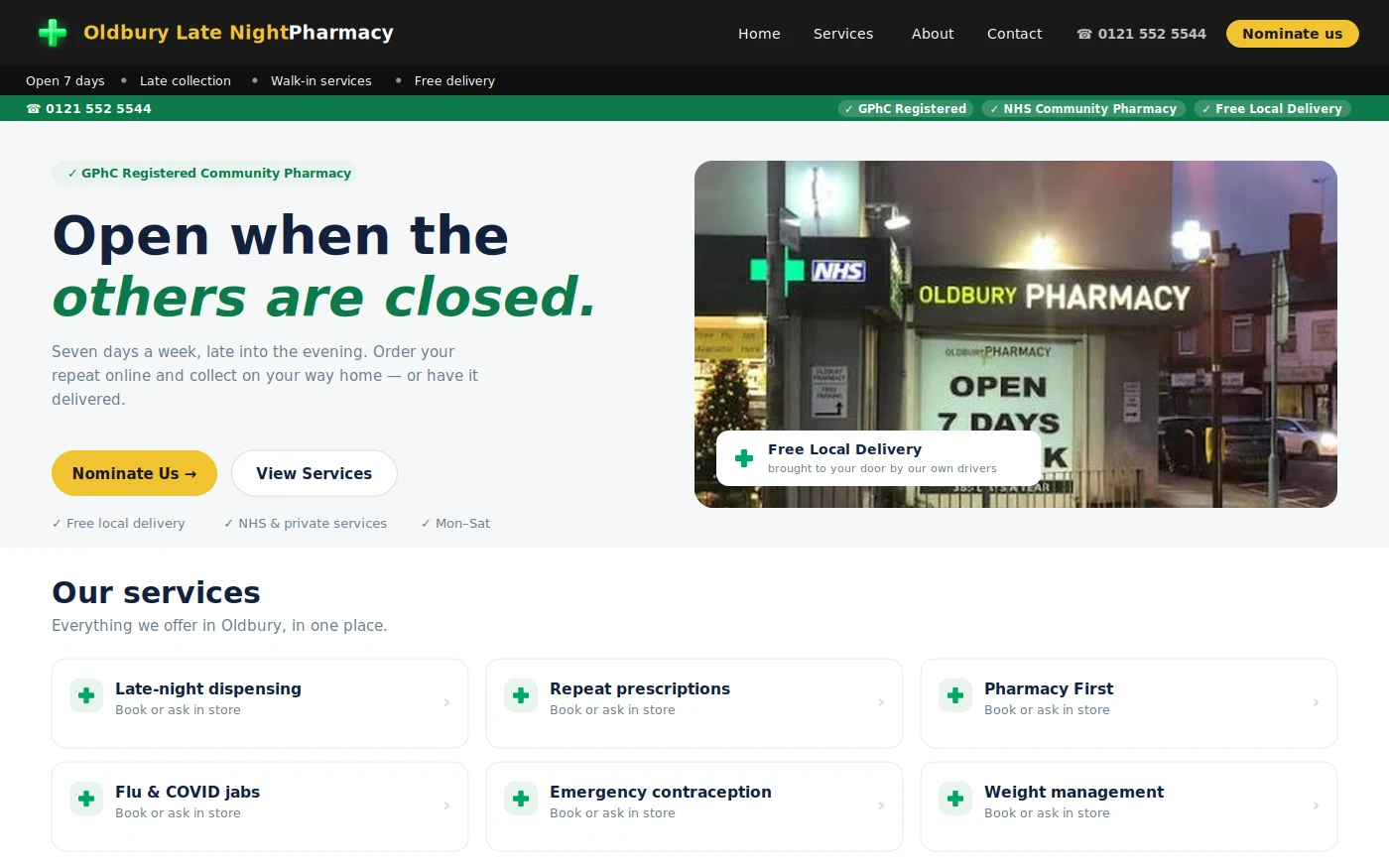
An extended-hours pharmacy trading seven days a week. The site leads with the two things patients search for it by — late opening and delivery — in the title, the first heading and the hours block, because that is the search it wins. Its online shop is collection-led and sized to what the pharmacy actually stocks.
Atherstone In-Practice Pharmacy
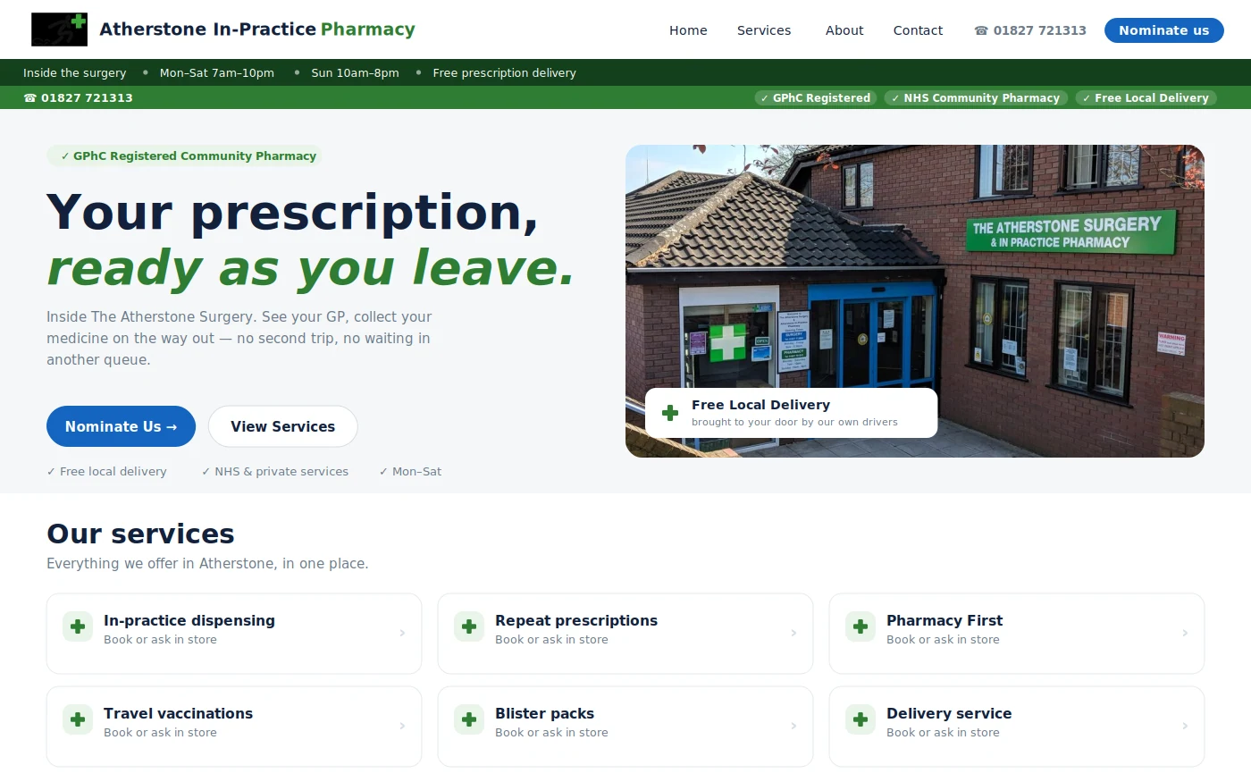
A pharmacy working alongside a GP practice, where the private weight-management service is a significant part of the business. The service has its own page with eligibility screening and booking, written to describe the programme and the consultation without naming prescription-only medicines — the constraint every pharmacy with this service has to design around.
What the good ones have in common
Service-led structure
One page per service, named the way patients search. This is the difference between ranking for "travel vaccinations Oldbury" and not existing for it. It is also what makes the site useful at the counter: "the details are on our website" only works if the details are actually there.
Forms that finish on a phone
Repeat and nomination forms asking for the minimum, completing in under a minute, landing in a dashboard with a status. The number of fields is the single biggest predictor of completion.
Real information, kept current
Opening hours including bank holidays, the actual superintendent's name, services you actually offer. A site that is right is more valuable than a site that is beautiful.
Light, white and fast
White backgrounds, one accent colour, real photographs of the pharmacy, no dark "colour shock" themes. Older patients and carers are a large share of the audience; contrast and legibility matter more than flair. Our pharmacy website design page explains the principles.
The disclosures in place
GPhC premises number, superintendent, company details, privacy notice. Boring, and the first thing a careful patient or a regulator looks for. See what a UK pharmacy must display.
What the poor ones have in common
- A single "Services" page of icons with no links and no eligibility information
- Stock photos of pills and of pharmacists who do not work there
- A contact form as the only way to do anything
- Hours that are wrong on a bank holiday
- No mention of Pharmacy First, three years after it launched
- A "news" page last updated in 2022
If your current site has three or more of these, the free website check will quantify it, and what a pharmacy website should include is the list to build from. You can see any of the sites above with your own pharmacy's name and services on it — we build the demo before you pay.